Modern Wedding Invitation Template Ideas Without the Fuss
Modern invitation ideas with clear typography, purposeful space and enough personality to feel like your day.
· 4 min read
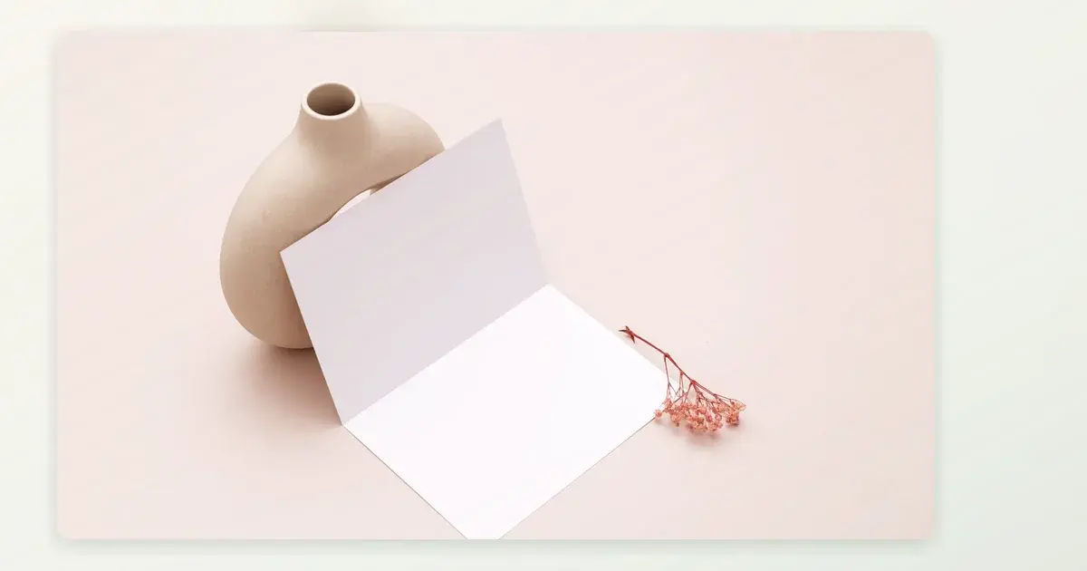
Modern does not have to mean cold, monochrome or stripped of personality. It can simply mean a clear hierarchy, intentional space and fewer competing details. A contemporary invitation is especially effective when your venue name or schedule needs to stand out. Use the ideas below as design decisions to test, not rules to copy.
Let typography set the pace
Choose one expressive element: a large pair of names, an elegant date treatment or a short line of welcome. Then use a restrained typeface for the information guests must act on. The contrast between display and practical text creates interest without making the address hard to read. If every line is dramatic, nothing leads the eye.
Try an asymmetrical layout with purpose
Place the names on one side and the event details in a clean block below or opposite. Alignment can make a simple card feel distinctive, but it needs to survive long surnames and a second venue. Check whether the reading order remains obvious when viewed on a narrow phone. If people scan the reception details before the ceremony location, restore a more conventional order.
A fine rule, a generous margin or one corner illustration may be enough to frame the text. Do not reduce essential type to preserve a large empty area. White space is useful only when the information still has room to speak.
Choose colour that supports the setting
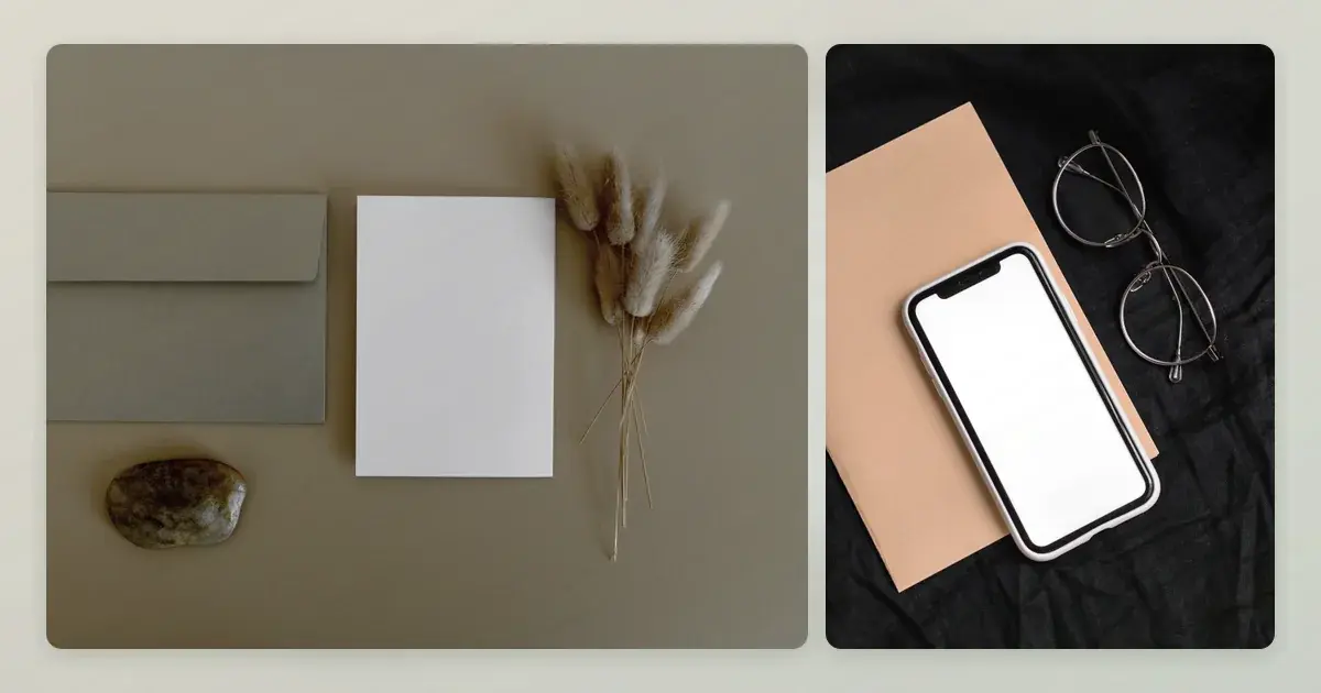
A modern palette can be soft ochre and deep brown, not only black and white. Try one neutral, one accent and a strong text colour. Test the combination at realistic size, especially in bright daylight on a phone. A low-contrast blush date against a cream ground may vanish exactly when a guest needs it.
Use texture or photography sparingly
A subtle paper-like background can warm up digital artwork. A photograph of the venue can establish a sense of place, but it should not sit behind the time and address. Put photography in its own panel or crop it as a small detail. If you are printing, request a proof: screen colours and paper finish will not look identical. A bold visual can stay on the front while practical details sit on a quieter companion panel.
For a broader method of comparing layouts against real names and addresses, start with the template selection guide. test a layout with your own wording
Translate the concept into usable information
Write the invite in plain text before arranging it. Put names, ceremony date and local time, venue name and address, reception arrangements, reply method and deadline in a sensible sequence. A destination or regional wedding may need a travel note elsewhere; avoid squeezing it into a tiny footer. If there are multiple events, label them rather than relying on spacing to imply which details belong together.
- Open the design on a small phone without zooming.
- Ask a friend to locate the ceremony time in a few seconds.
- Check that long names and addresses do not collide with decorative elements.
- Read the reply instruction aloud; it should make sense outside the design context.
Minimal does not mean omitting useful facts. You can leave out a decorative quote, not the entrance guests need to use. For a ceremony and reception at the same venue, a simple “Reception to follow” may suffice; when they are at different addresses, name both clearly.
Make the style personal without clutter
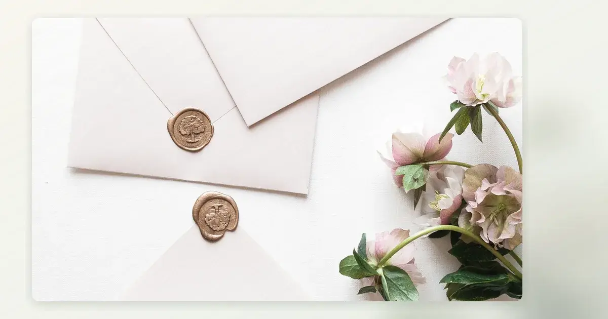
Consider one detail with a connection to the day: a colour borrowed from the landscape, a line drawing of a familiar place or wording that sounds like the two of you. Keep it subordinate to the schedule. If one partner likes ornate florals and the other wants a clean layout, a restrained botanical corner may bridge the styles without compromising readability.
That balance is easier to see in examples of botanical artwork used with deliberate restraint. consider a floral alternative
Ahmy's Modern design page is currently a preview of an aesthetic direction, not a live editor or ordering flow. preview The Modern
Before settling, compare the design with the same wording in a plain document. If the visual treatment introduces ambiguity, simplify it. The invitation succeeds when a guest can enjoy the style and still know exactly what to do next.