Floral Wedding Invitation Templates: A Considered Style Guide
A practical guide to floral illustration, colour and layout that keeps your wedding information easy to find.
· 4 min read
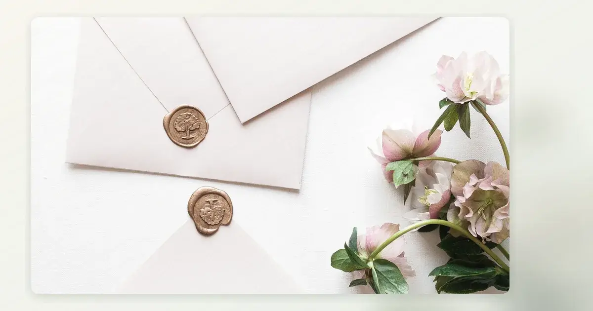
Florals can feel loose and summery, sculptural and formal, or quietly botanical. The difference is not just which flowers appear; it is their scale, placement and relationship to the words. Choose a floral direction with the location and season in mind, then make sure the artwork gives the guest information enough room.
Start with the atmosphere, not a flower name
Describe the celebration in a few words: perhaps relaxed garden lunch, formal evening dinner or a coastal ceremony followed by drinks. Use those words to filter designs. A loose spray of native-inspired shapes may suit a relaxed outdoor gathering; a small pressed-flower detail can feel more intimate than an elaborate border. You do not need to depict the exact flowers in your bouquet, especially if the final arrangements are not chosen yet.
Border, corner or motif?
A full border frames short wording but can crowd long names and addresses. Corner artwork creates a clear path for the eye while keeping a botanical feel. A single motif above the names leaves the details undisturbed. Test the most information-heavy version of your copy before deciding. If the floral art must be shrunk to a barely visible trace to fit the venue details, choose a different composition.
Think also about cultural or personal meaning. A plant associated with a family garden may feel more relevant than an on-trend bloom. If you use artwork based on native flora, take care with identification and avoid implying a connection you do not have. The invitation can be evocative without making a botanical claim.
Set a palette that can be read
Let the illustration carry the softer colours and keep functional text dark enough against its background. Pale sage, dusty pink and cream may work together in a mood board, but pale sage type on cream can be difficult to read. Test the venue address, time and reply deadline in daylight on a phone. If you intend to print, view a proof in the paper stock you would use.
Leave a quiet zone for the details
The essential copy needs a stable, uncluttered area. Place blossoms at the edge, behind a clearly opaque text panel or on a separate side of the layout. Avoid thin lettering over leaves, even if the preview looks delicate. If the invitation has both a ceremony and reception location, group each location with its own time rather than splitting the information around the artwork.
A general template checklist can help you evaluate the actual copy before you commit to a decorative composition. choose a layout around your details
Make it seasonal without making it disposable
Spring does not require pastel peonies; autumn does not require rust-coloured leaves. Borrow a subtle cue from the season, then choose colours you will still like when you look back at the invitation. Regional conditions matter too: the garden setting you are picturing may look different at your actual date. Ask the venue what is usually in bloom if that specific connection is important to you.
- Put full names, date, time and address into the design before judging it.
- Check whether a long response instruction stays legible beside the illustration.
- Compare a phone view with a printed-size view if using both formats.
- Have another reader identify the venue and response deadline without prompting.
FAQ: can florals work for a formal wedding?
Yes. Restraint and type choice often determine formality more than the flower itself. A small botanical illustration paired with generous margins and precise wording can feel formal. Oversized blooms, conversational copy and varied lettering may feel more relaxed. There is no need to make every element match the bouquets or table settings exactly.
If you prefer a quieter composition, compare these typography-led contemporary approaches before settling on a border. modern invitation ideas
Ahmy's Garden design page offers a preview of one botanical direction, not a live creation or sending service. preview The Garden
Once the design feels right, have someone proof the practical details against your venue confirmation rather than your memory. Beautiful floral artwork can invite a long look, but guests should never have to search through it to find when to arrive.